It’s been a little over five years since our last coffee table book guide, so I think it’s high time we revisit this space to see what other reading materials — with an emphasis on art and design — are worth keeping out on display in your home rather than on a shelf.
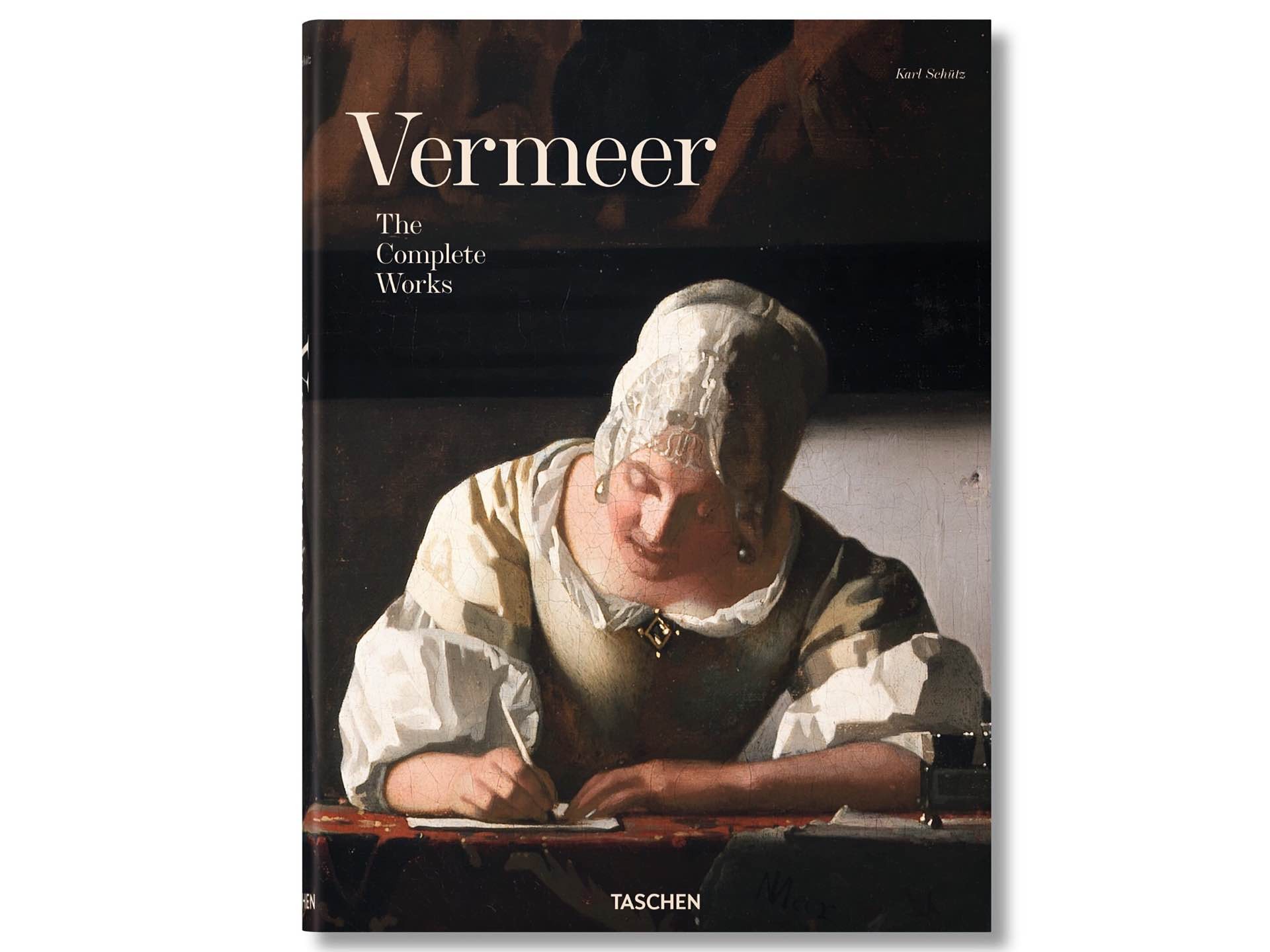
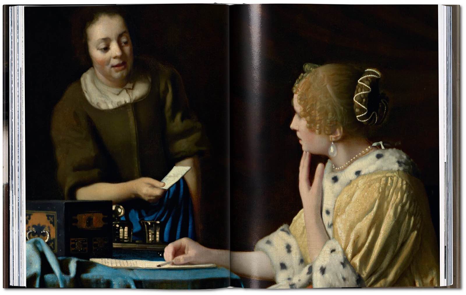
Vermeer: The Complete Works by Karl Schütz / Taschen. ($32 hardcover)
Vermeer: The Complete Works »
Unless you’re an art geek, the name Johannes Vermeer may not ring an immediate bell. Still, chances are you’ve at least seen his famous painting, Girl with a Pearl Earring, often referred to as the “Dutch Mona Lisa”.
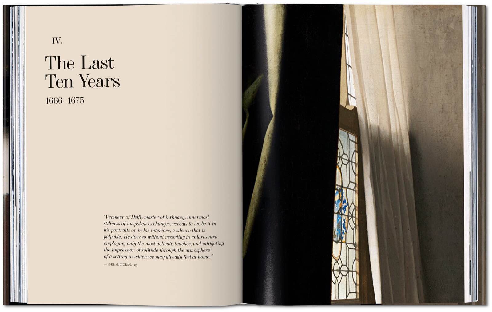
Vermeer: The Complete Works, an enormous hardcover book written by art historian Karl Schütz — and created as part of Taschen’s The Complete Works series of art books — brings together Vermeer’s entire body of work into one stunningly beautiful 258-page collection.
From the description:
With new photography of many works, Vermeer’s restrained but richly evocative repertoire of domestic actions–ranging from letter writing to music making to preparations in the kitchen–unfolds in generous format. Numerous details emphasize the artist’s remarkable ability not only to bear witness to the trends and trimmings of the Dutch Golden Age but also to encapsulate an entire story in just one transient gesture, expression, or look.
In his lifetime, Vermeer’s fame barely extended beyond his native Delft and a small circle of patrons. After his death, his name was largely forgotten, with works outside of Holland even misattributed to other artists. It was not until the mid-19th century that Vermeer came to the attention of the international art world, which suddenly looked upon his narrative minutiae, meticulous textural detail, and majestic planes of light, and spotted a forgotten master.
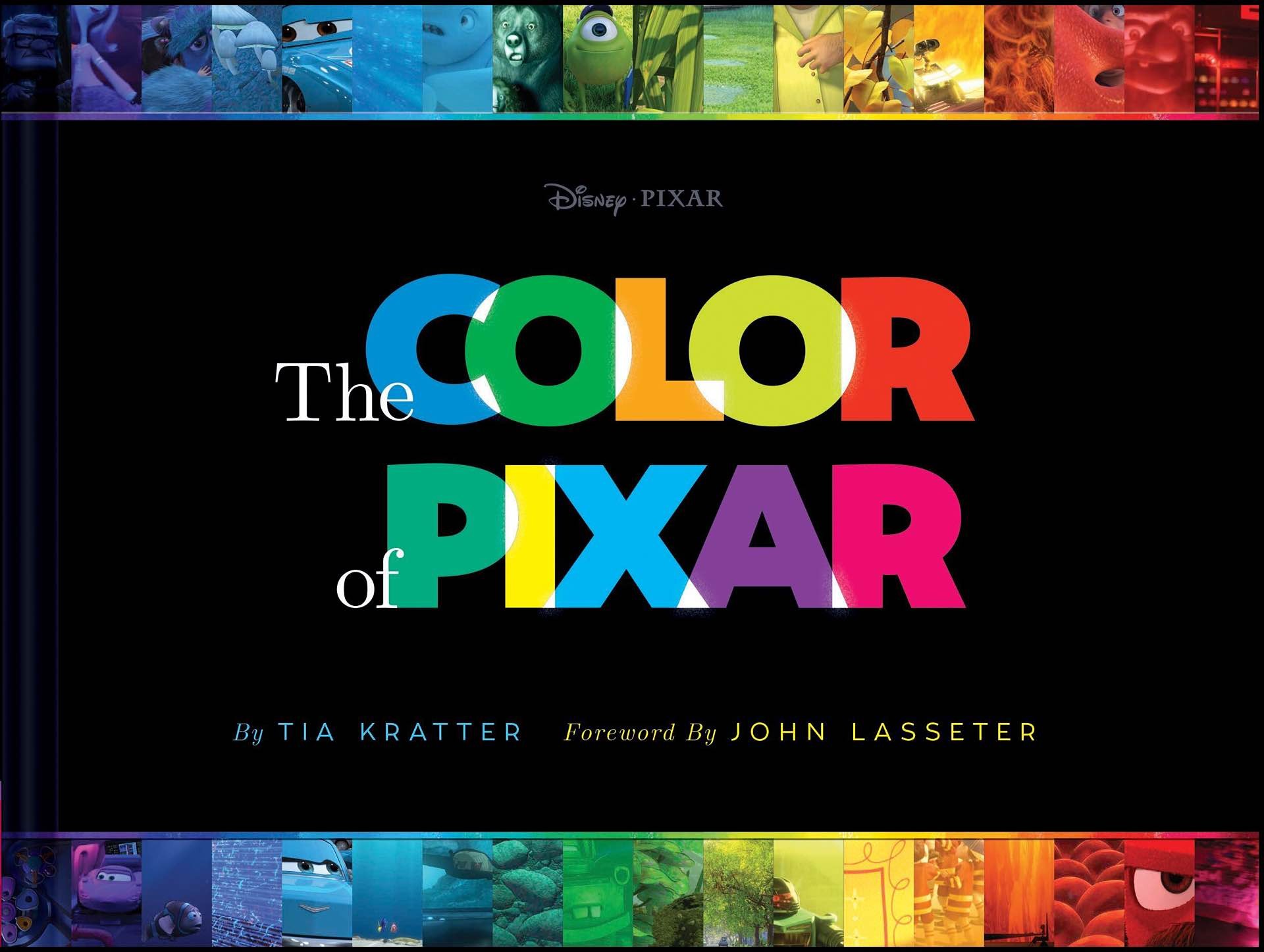
The Color of Pixar by Tia Kratter. ($21 hardcover)
The Color of Pixar »
The Color of Pixar is a gorgeous, 352-page (yet virtually textless) tome written by long-time Pixar artist Tia Kratter, which compiles hundreds of still images from Pixar films — from Toy Story all the way to Coco — and organizes them across the color spectrum.
From the description:
Bold and beautiful, this volume presents hundreds of film stills from the Pixar archives in a glorious spectrum of color. Starting with bright white images and seamlessly flowing through the colors of the rainbow, it becomes crystal clear how each frame tells a story. Bound into a gorgeous volume, The Color of Pixar encapsulates everything there is to love about the studio: the attention to detail, the playful characters, and the sheer scope of their work in over 20 years of iconic feature films.
The folks at the Pixar Post blog posted a quick preview video of what’s inside the book:
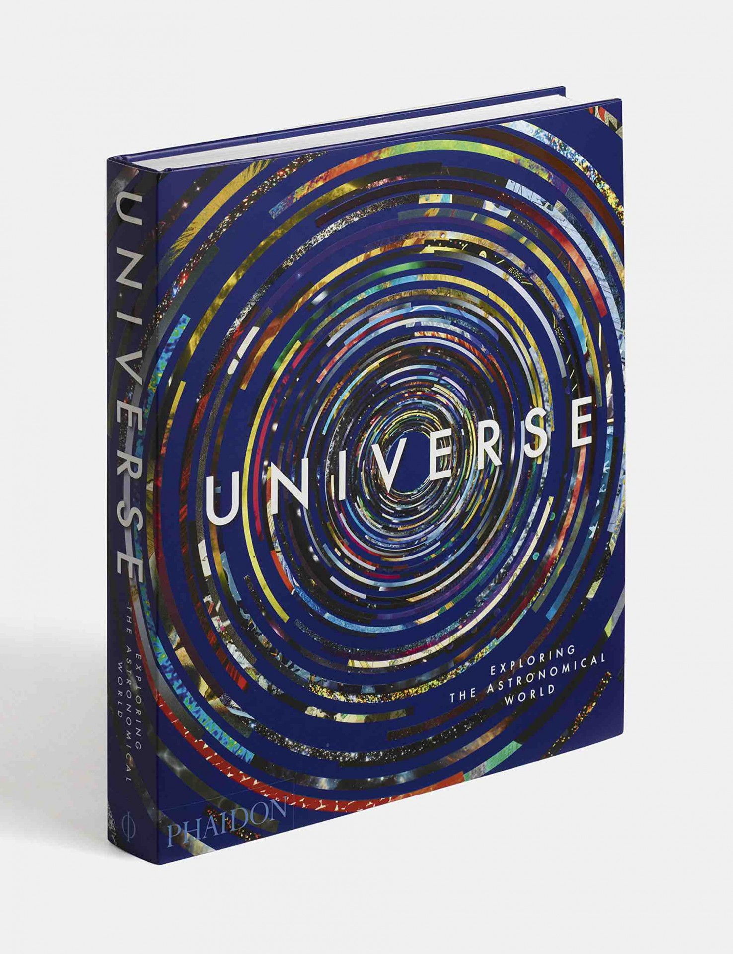
Universe by Phaidon. ($31 hardcover)
Universe: Exploring the Astronomical World »
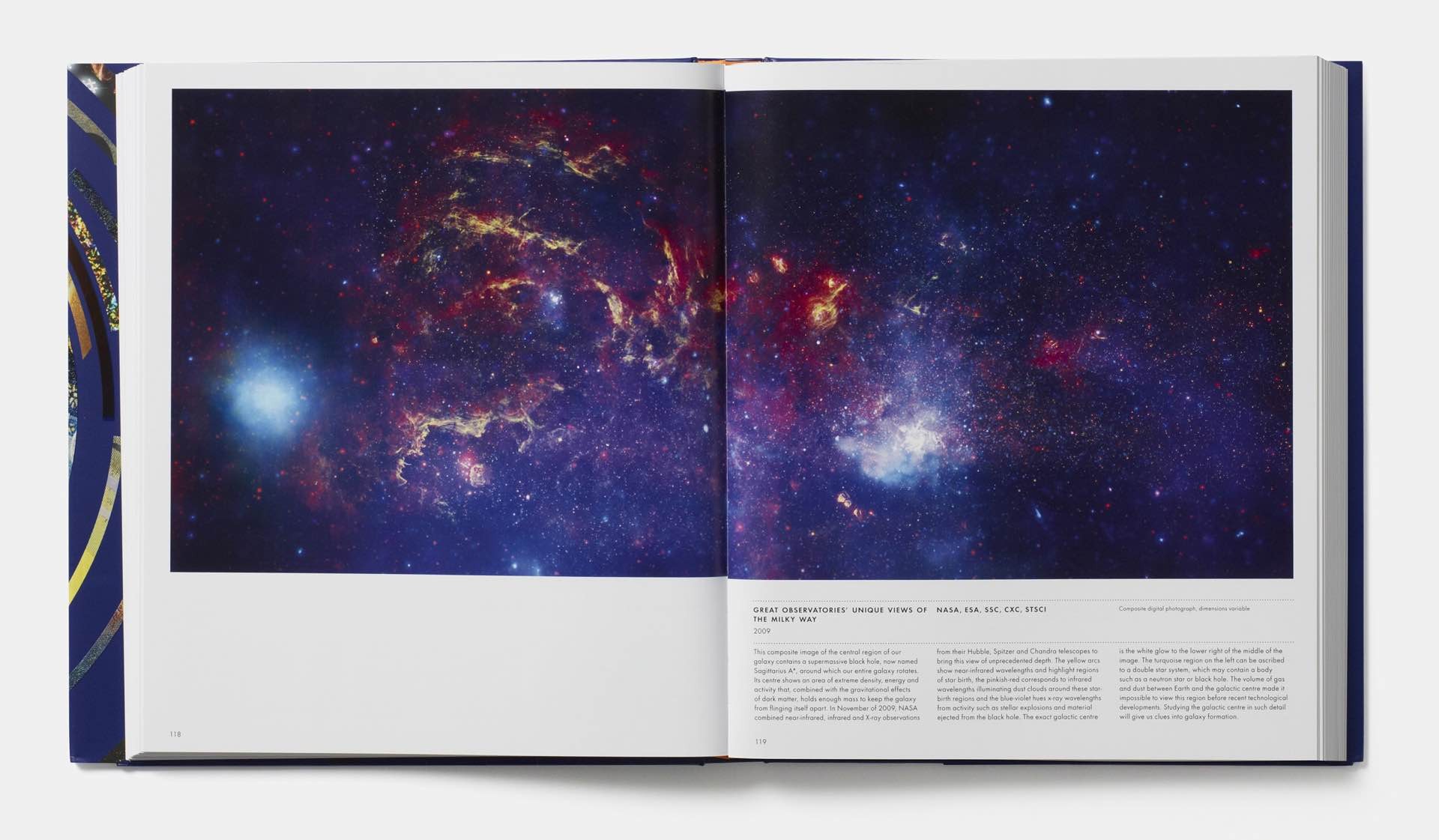
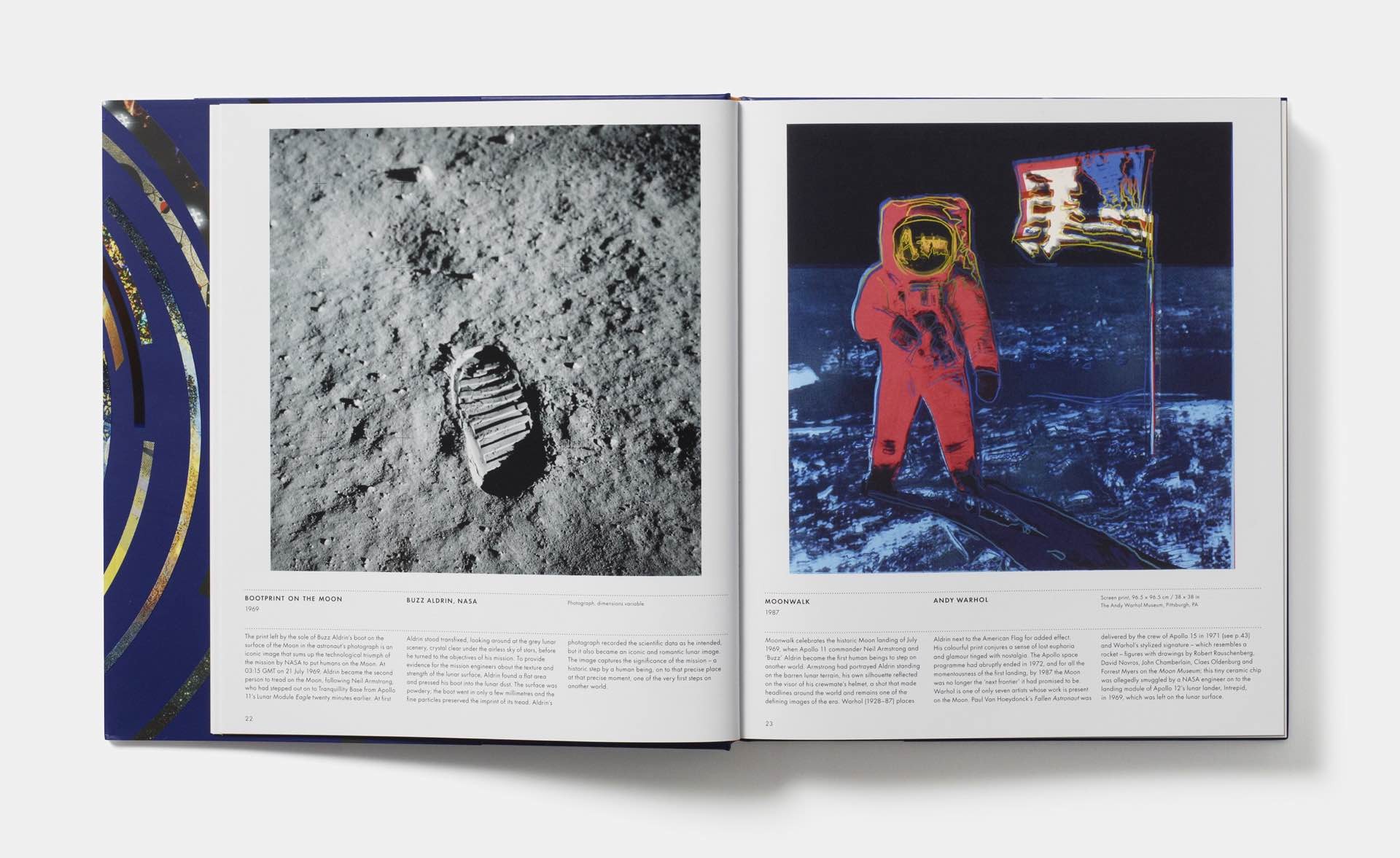
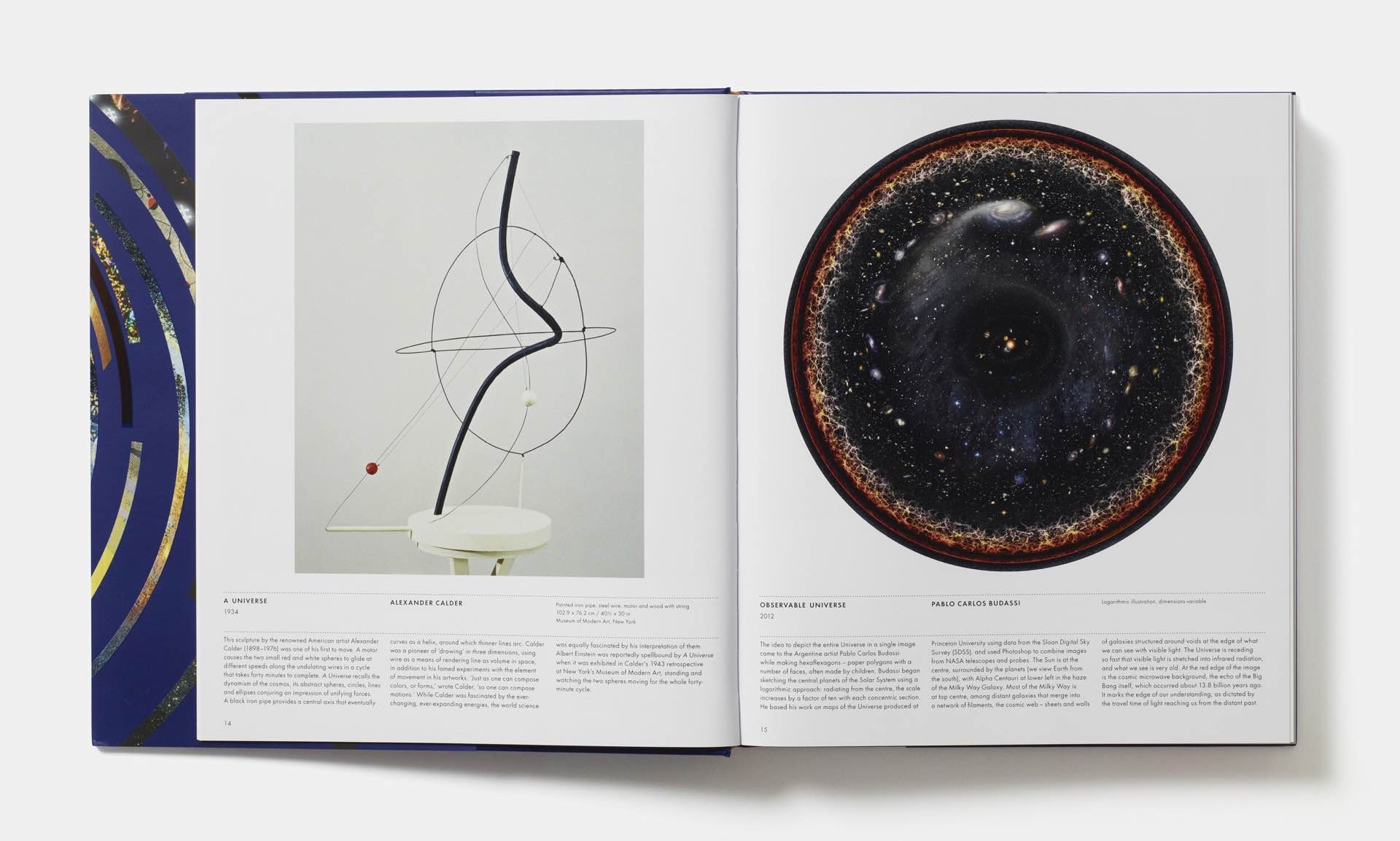
Universe: Exploring the Astronomical World comes from the editors at book publisher Phaidon, collecting 300 images — including photos, paintings, sculpture, animation, prints, sketches, and digital renderings — celebrating the culture of astronomy:
Universe is a groundbreaking survey that celebrates the popular subject of astronomy through 300 images created by those who have tried to understand – or who have been inspired by – the beauty and mystery of stars, planets, and beyond.
The images in this 352-page hardcover have been “carefully chosen by an international panel of experts and arranged to highlight thought-provoking contrasts and similarities”, some of which had even gone unpublished prior to its release. Here are some examples of what you’ll find within:
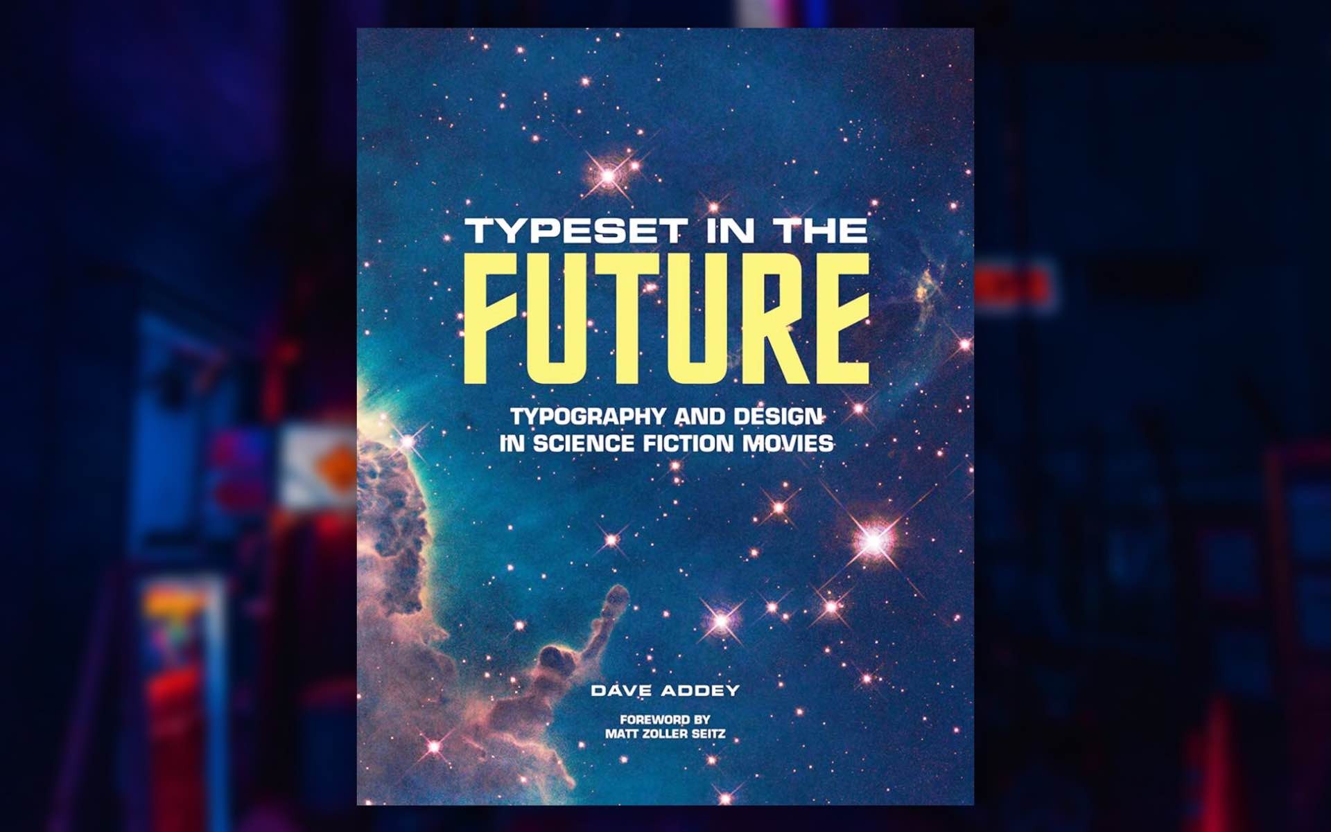
Typeset in the Future by Dave Addey. ($28 hardcover)
Typeset in the Future »
Dave Addey’s geeky and humurous Typeset in the Future blog is all about typography and iconography as seen in sci-fi/fantasy movies and TV shows. Most of his posts there are long and weirdly enlightening in their own way, while some are short and entertaining, like when he explains how to make your text look futuristic.
In 2018 he turned his attention to creating a 264-page book akin to the blog. He calls it “an obsessively geeky study of how classic sci-fi movies draw us in to their imagined worlds.”
From the description:
In Typeset in the Future, blogger and designer Dave Addey invites sci-fi movie fans on a journey through seven genre-defining classics, discovering how they create compelling visions of the future through typography and design. The book delves deep into 2001: A Space Odyssey, Star Trek: The Motion Picture, Alien, Blade Runner, Total Recall, WALL·E, and Moon, studying the design tricks and inspirations that make each film transcend mere celluloid and become a believable reality.
The book also includes additional typography studies, film stills + concept art, and interviews with experts in various fields — like sci-fi, typography, and design — along with people who have actually worked on the films and TV shows being studied. Examples of these ephemera include:
- A study of the tricks movies use to make their worlds look realistic without distracting you from the plot.
- A detailed guide on how to make your own text look futuristic.
- A study of futuristic movie font Eurostile Bold Extended.
- A foreword from Matt Zoller Seitz, editor-in-chief of RogerEbert.com, and author of New York Times bestsellers The Wes Anderson Collection and The Wes Anderson Collection: Grand Budapest Hotel.
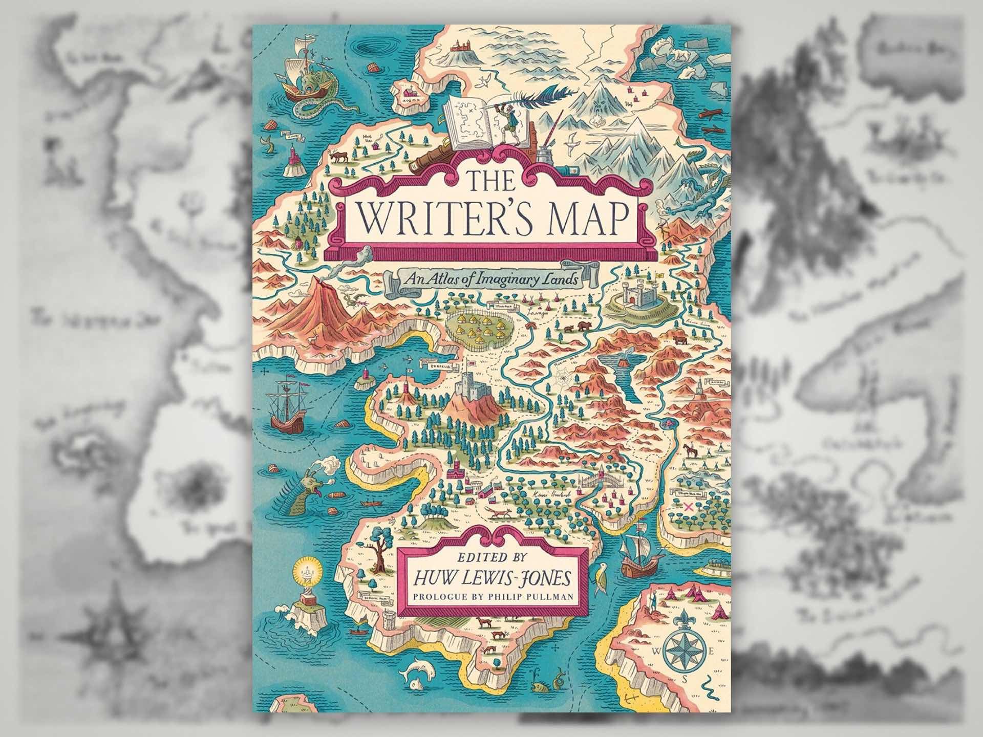
The Writer’s Map: An Atlas of Imaginary Lands by Huw Lewis-Jones. ($31 hardcover)
The Writer’s Map »
Seriously, is there any better feeling than cracking open a new novel and, before the story even begins, being greeted with a map? Do you ever just bookmark that page and reference it again and again, all book long, trying your best to pronounce every place’s name each time you come across it? Maybe you use the word “worldbuilding” in everyday conversation, to an embarrassing degree.
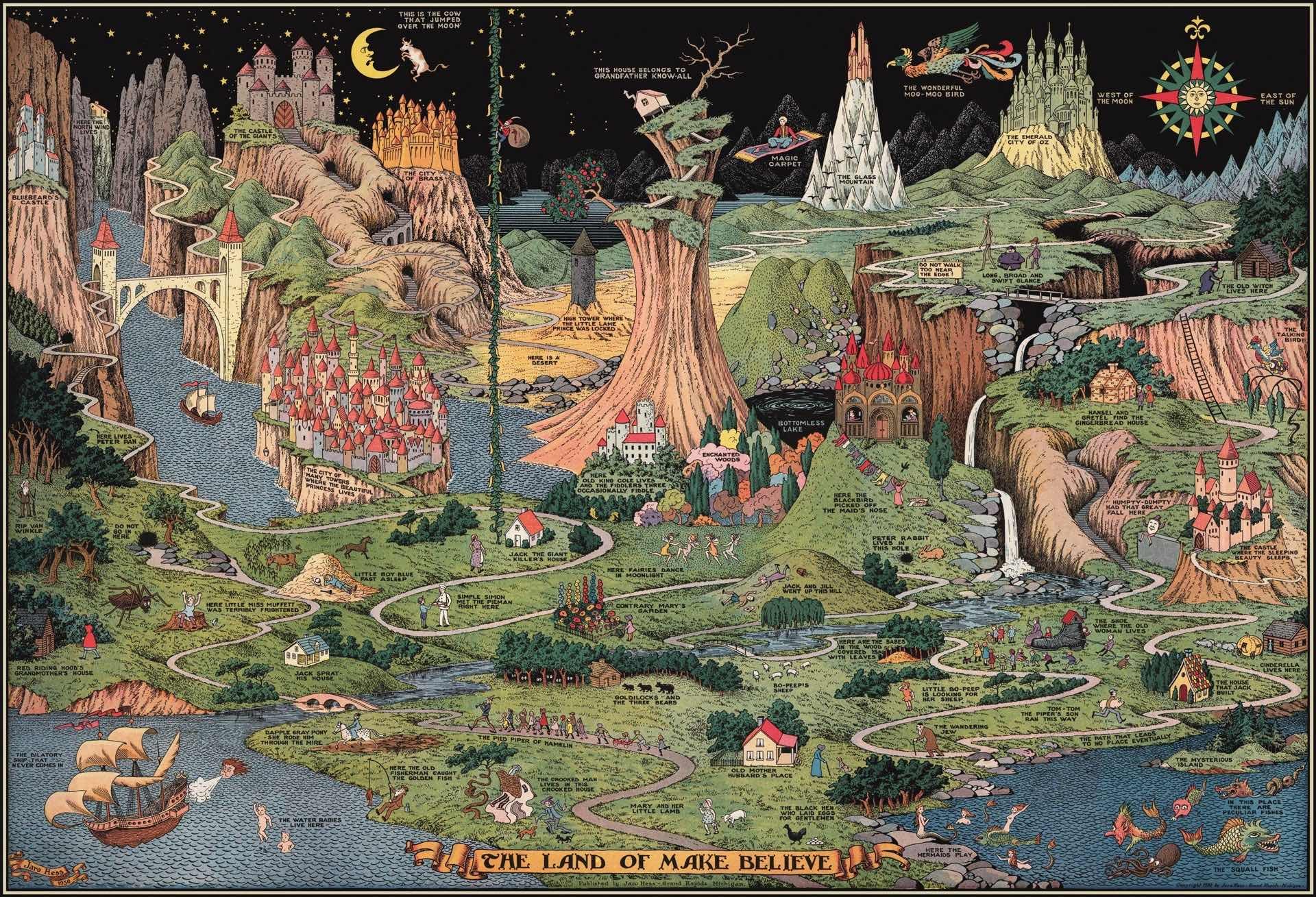
If you’re relating hard right now, you’d do well to check out Huw Lewis-Jones’ 256-page coffee table compendium, The Writer’s Map: An Atlas of Imaginary Lands. Inside is a veritable feast of 167 lovingly reproduced, full-color maps taken from many eras of fantasy literature and beyond, along with a series of essays and personal reminisces by writers and artists on their love of fantasy cartography.
From the description:
It’s one of the first things we discover as children, reading and drawing: Maps have a unique power to transport us to distant lands on wondrous travels. Put a map at the start of a book, and we know an adventure is going to follow. Displaying this truth with beautiful full-color illustrations, The Writer’s Map is an atlas of the journeys that our most creative storytellers have made throughout their lives. This magnificent collection encompasses not only the maps that appear in their books but also the many maps that have inspired them, the sketches that they used while writing, and others that simply sparked their curiosity.
Philip Pullman recounts the experience of drawing a map as he set out on one of his early novels, The Tin Princess. Miraphora Mina recalls the creative challenge of drawing up “The Marauder’s Map” for the Harry Potter films. David Mitchell leads us to the Mappa Mundi by way of Cloud Atlas and his own sketch maps. Robert Macfarlane reflects on the cartophilia that has informed his evocative nature writing, which was set off by Robert Louis Stevenson and his map of Treasure Island. Joanne Harris tells of her fascination with Norse maps of the universe. Reif Larsen writes about our dependence on GPS and the impulse to map our experience. Daniel Reeve describes drawing maps and charts for The Hobbit film trilogy.
This exquisitely crafted and illustrated atlas explores these and so many more of the maps writers create and are inspired by—some real, some imagined—in both words and images.
This book is a wonderful ode to the mythology and sense of adventure found within fictional maps.
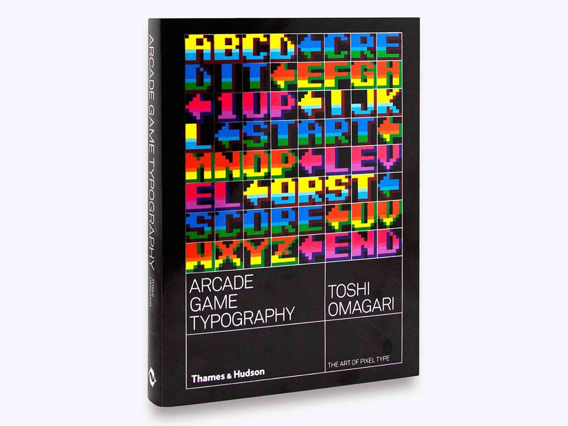
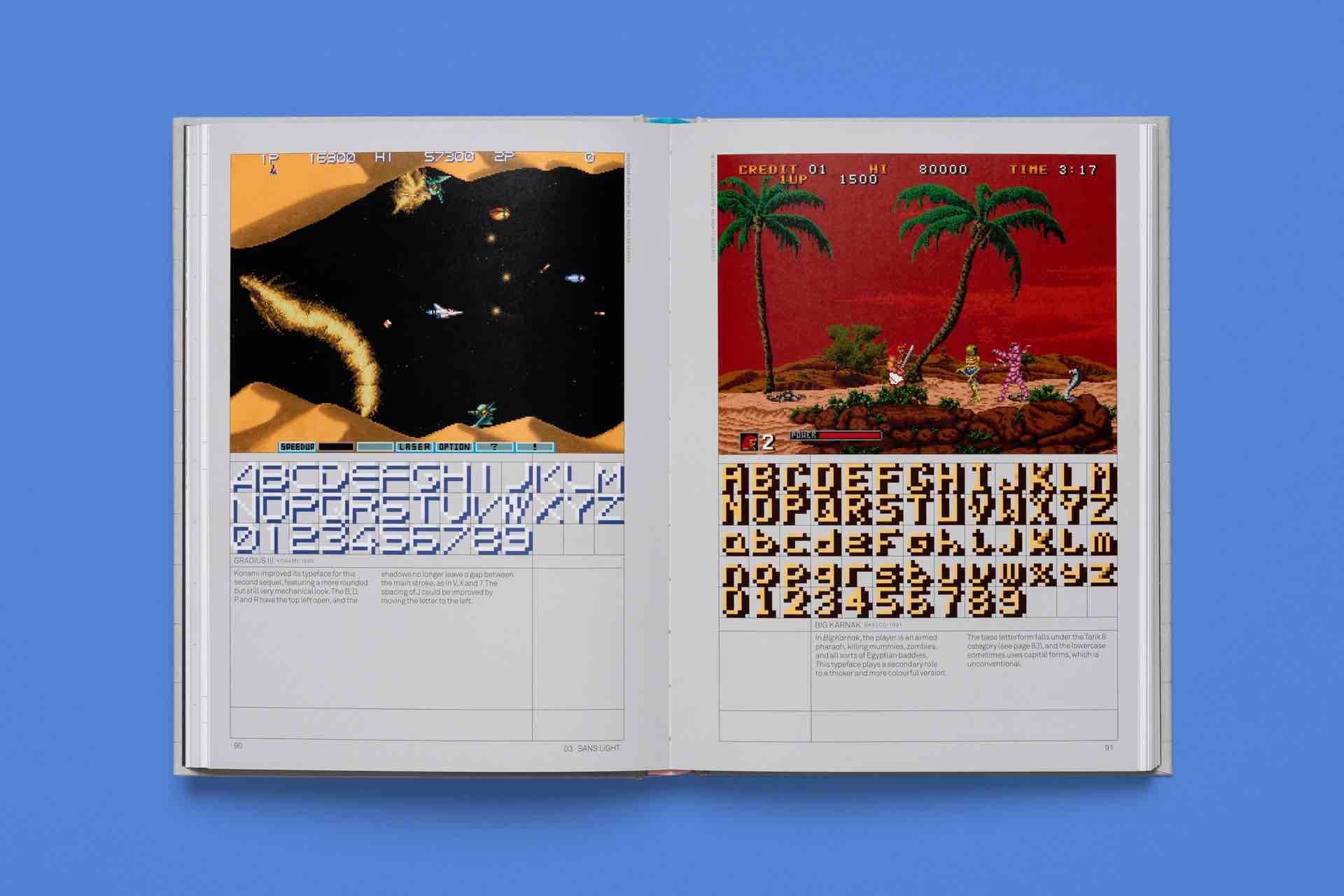
Arcade Game Typography: The Art of Pixel Type by Toshi Omagari. ($28 paperback)
Arcade Game Typography »
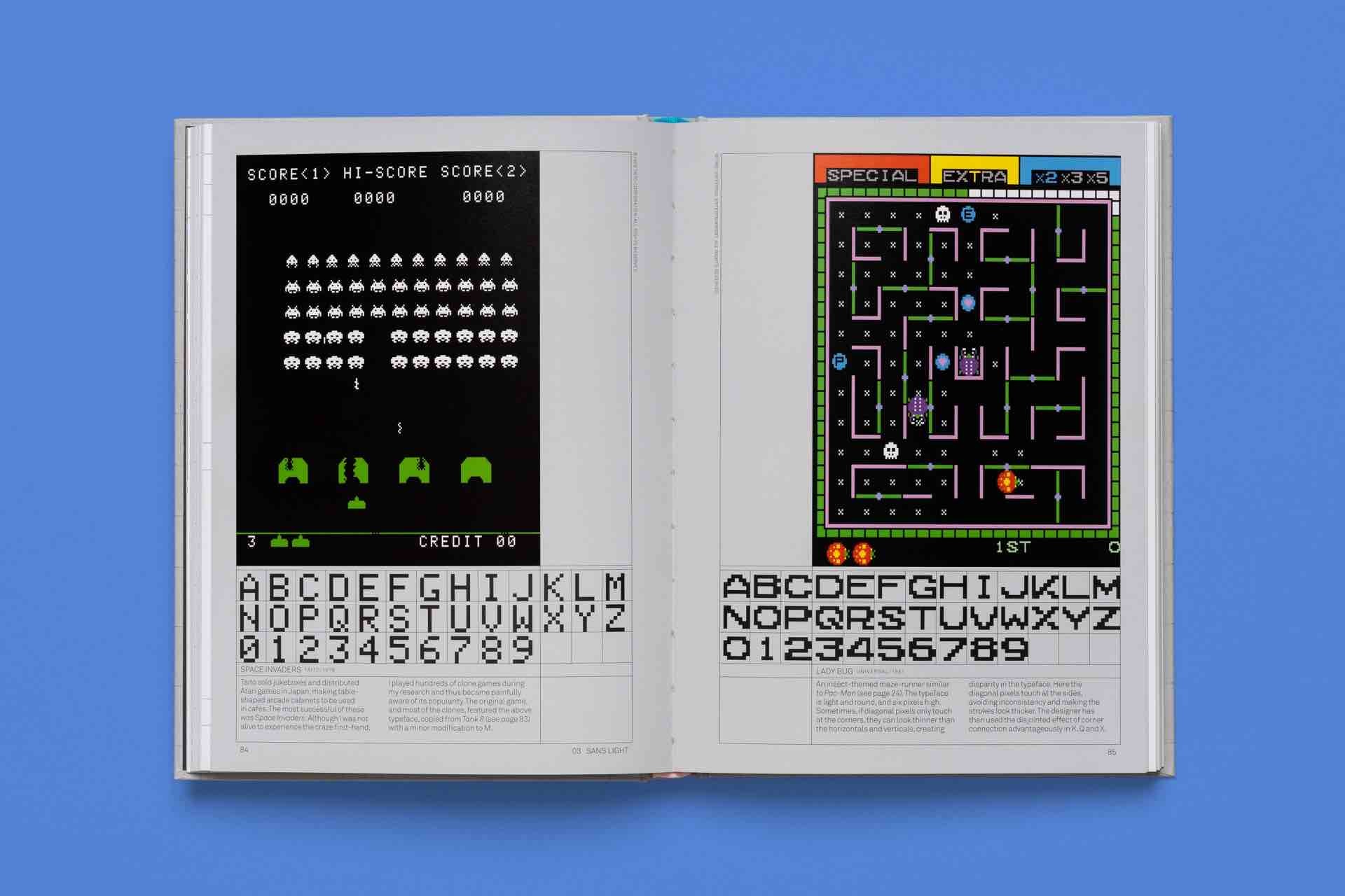
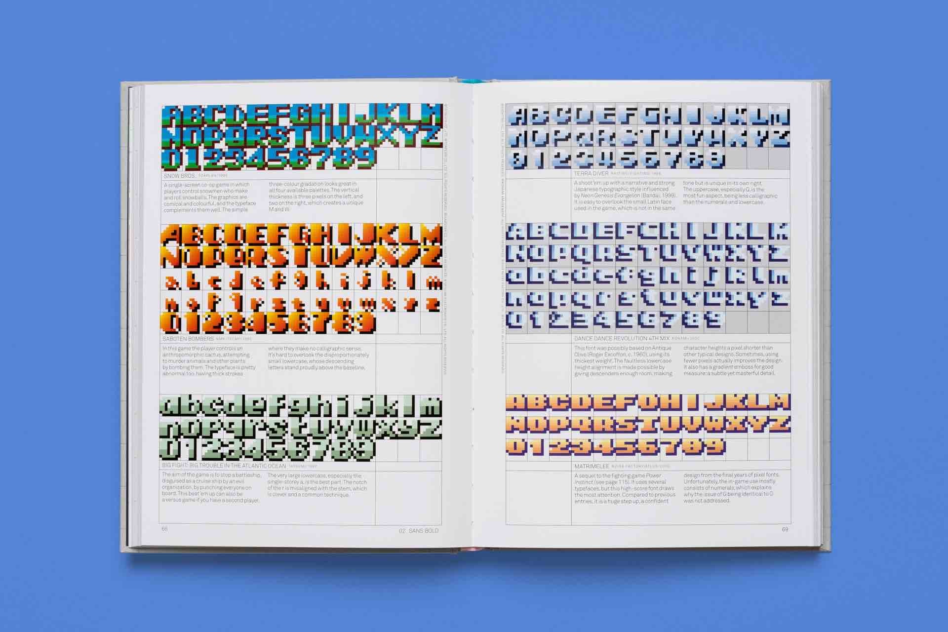
Compiled by celebrated typeface designer Toshi Omagari, Arcade Game Typography: The Art of Pixel Type is a beautifully organized, delightfully geeky, and definitive tour through the distinctive pixelated fonts of retro arcade games from the 1970s through the 1990s — and yes, referring to the ’90s as “retro” hurts us as much as it does you.
From the description:
Video game designers of the ’70s, ’80s, and ’90s faced color and resolution limitations that stimulated incredible creativity. With each letter having to exist in a small pixel grid, artists began to use clever techniques to create elegant character sets within a tiny canvas. This book presents typefaces on a dynamic and decorative grid, taking reference from high-end type specimens while adding a suitably playful twist. Arcade Game Typography recreates that visual aesthetic, fizzing with life and color.
Inside this thoroughly researched and nostalgic compendium you’ll find 300 vivid color illustrations across 272 pages, along with commentary by Omagari himself, the sum of which makes absolutely clear how creative game designers had to be about typography using such a limited palette.
As this Amazon reviewer succinctly puts it, it’s “a unique way of thinking about the history of video games, in terms of how art and technical limitations meet.”
Games represented in the book include such classics as Pac-Man, After Burner, Super Sprint, Marble Madness, Shinobi, and more. This is really unlike any typography book I’ve come across before, and every page is a blast from the past. Highly recommended.
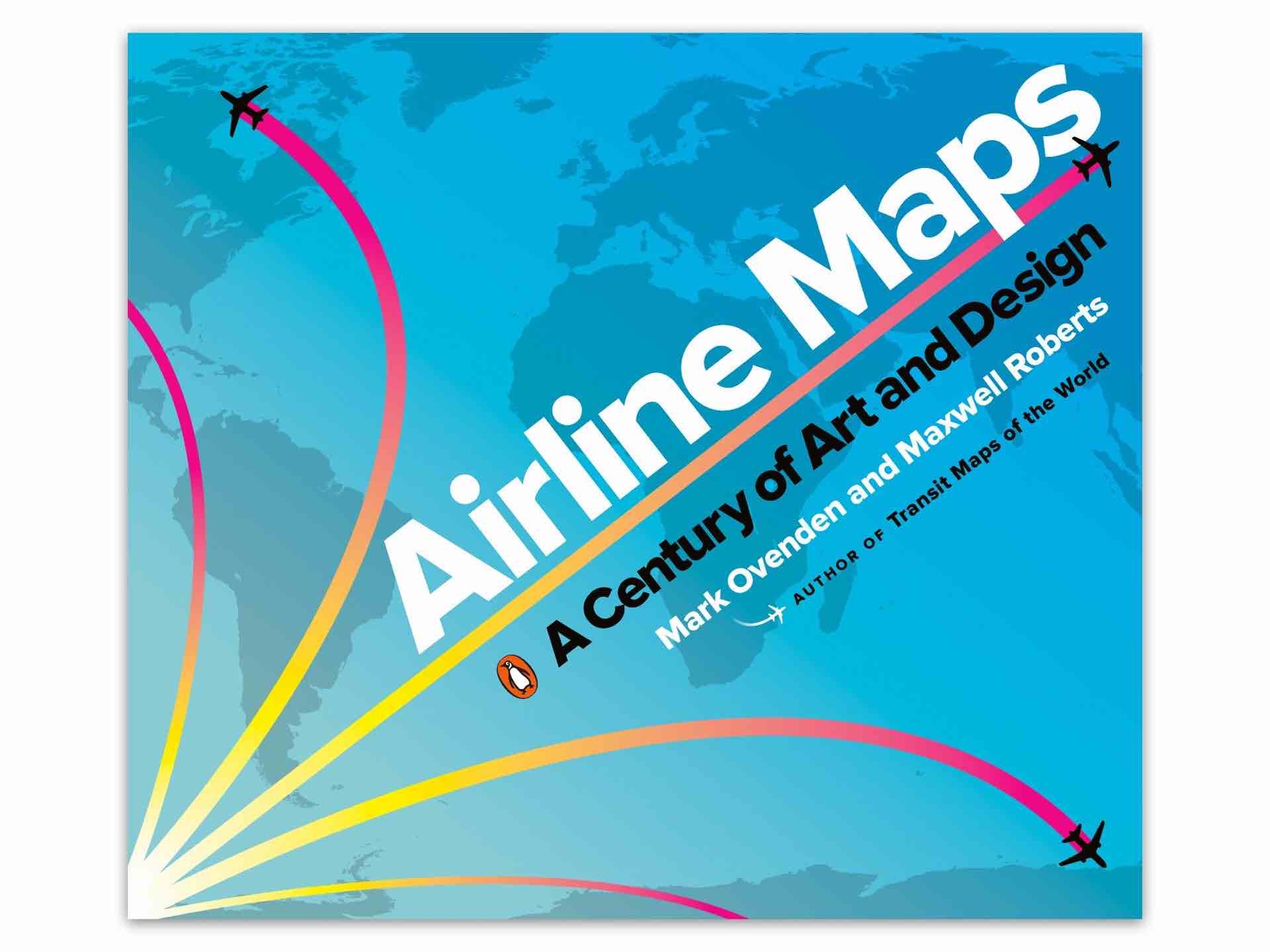
Airline Maps: A Century of Art and Design by Mark Ovenden and Maxwell Roberts. ($21 paperback)
Airline Maps »
Now we come to the smallest book in today’s roundup, though no less worthy of being on your coffee table.
Last year, transit/design historians Mark Ovenden and Maxwell Roberts worked together to produce Airline Maps, which collects a century’s worth of gorgeously illustrated, full-color airline route maps — from the glamorous early days of commercial flight to today:
From the first faltering flights over plains, water, and mountains to the vast networks of today, air travel has transformed the world and how people see it. Maps played their part in showing what was possible and who was offering new opportunities. As tiny operations with barely serviceable airplanes pushed out farther and farther, growing and merging to form massive global empires, so the scope of their maps became bigger and bolder, until the entire world was shrunk down to a single sheet of paper. Designs featured sumptuous Art Deco style, intricate artistry, bold modernism, 60s psychedelia, clever photography, and even underground map-style diagrams.
For the first time, Mark Ovenden and Maxwell Roberts chart the development of the airline map, and in doing so tell the story of a century of cartography, civil aviation, graphic design and marketing. Airline Maps is a visual feast that reminds the reader that mapping the journey is an essential part of arriving at the destination.
Throughout this 144-page book you’ll find wonderfully creative and diverse maps by airlines that no longer exist (PanAm, TWA, etc) right alongside those of airlines still going strong. You also get to see how the design of airline cartography evolved over the course of decades, back when people were still excited about flight as a thing.
Advertisements for the first scheduled commercial passenger flights featured only a few destinations, with stunning views of the countryside and graphics of biplanes. As aviation took off, speed and mileage were trumpeted on bold posters featuring busy routes. Major airlines produced highly stylized illustrations of their global presence, establishing now-classic brands. With trendy and forward-looking designs, cartographers celebrated the coming together of different cultures and made the earth look ever smaller.
Eventually, fleets got bigger and routes multiplied, and graphic designers have found creative new ways to display huge amounts of information. Airline hubs bring their own cultural mark and advertise their plentiful destination options. Innovative maps depict our busy world with webs of overlapping routes and networks of low-cost city-to-city hopping.
We recommend reading this interview with the authors by Jennifer Nalewicki of Smithsonian Magazine, which covers why Ovenden and Roberts decided to make this book and shows off some of the kinds of illustrations you’ll find within it.
